


Project Brief
Pune is a smart city that is not only rich in heritage but is also one of the top 3 cities to live in. It is also known for its large number of privately owned two-wheelers on road. Public transport in Pune is mainly facilitated by the PMPML Bus Transportation Services. Since there is no presence of local trains or metros yet, buses are the only economical public transport available.
Having used the bus service myself, I was keen to think about solutions that would make the process seamless and more user-friendly. Surprisingly, I found out at a very later stage that there is an official government application for PMPML which already exists.
After analyzing the existing application, I found out many aspects which could be improved, hence, I decided to revamp the entire application by focusing on making it a more holistic solution.
Understanding The Domain
In order to completely examine the current landscape of the public transport service in the city, I needed to do thorough desk research.
Research objectives -
1. Secondary Research
-
To find out the working of the PMPML Buses
-
To find what problems PMPML is facing
-
To study public bus transport in India
2. Primary Research
-
To know the pain points of the users
-
To know how they would like to improve it
About Public Transport in India
-
Buses makeup over 90% of public transport in Indian cities and serve as a cheap and convenient mode of transport for all classes of society
-
It is therefore imperative that cities across India focus on sustainable transport and set targets to achieve a higher modal share of public transport
-
Interestingly, according to the National Sample Survey Office (NSSO), the bus is the most preferred means of transport in both rural and urban areas.


About PMPML
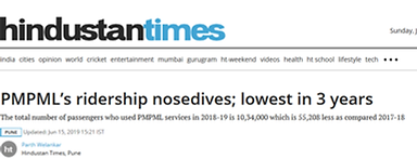
Ferrying 12 lakh passengers daily, on average, it is presently one of the most trusted modes of commuting amongst Pune residents. Presently the routes cover a radius of 20 km in and around the Pune and Pimpri Chinchwad area. Plans of further expansion are on their way to be implemented.
However, in recent times there are various challenges being faced along with reducing quality and ridership, as seen in below news articles.


User Research
Survey Objective - To find out the pain points of the bus users and to know what all improvements they would like to make their experience smoother. To also understand the perspective of the non-bus users and learn the reasons behind that and what will encourage them to use it.
Survey Method - Online Form
Sample Size - 30 users
User Groups -
Pune Bus Users - Regular/ Occasional
Nonusers- From Pune, Outside Pune
Insights -
-
Most people have used the bus occasionally or very few times whereas only 30% had used it on a daily basis. This indicated clearly that people prefer to use their private vehicles at most times rather than the bus service.
-
A very minimal share of people found it extremely convenient to use, the rest were not very satisfied with it. This reflects the poor quality of the current bus system.
-
The most common problems faced by the users while using the bus were long wait times for buses, overcrowded buses, poorly maintained bus stops and lack of cleanliness. Other issues included trouble locating bus stops, rude people and language barriers.
-
Increase in the frequency of buses, stop wise route displays and live tracking of bus location were the most suggested improvements. other improvement ideas included digital bus details display and cashless ticket payment.
-
60% of the users surveyed had never used an app for traveling by public transport and the ones who had used an app were mostly using google maps and m indicator.
-
When users who had not used the bus in Pune before were asked the reason behind it, the most common answers were unreliable bus schedules, lack of nearby bus stops and overcrowding.
-
Lastly for the question - what features would they like to see in a travel app, their answers mainly included live location tracking, detailed schedule and routes, nearby stop locator, cashless payment, an indication of how full the bus is, and a simple and easy to use interface.
This survey helped a lot in giving insights about what problems the users are really facing and how they would like them to be solved.
Heuristic Evaluation of Existing Application

Visibility of system status
-
The app uses a horizontal navigation bar that tells the user which page or section they are on.
-
There is a loading screen if the app is taking time.
Heuristic Violated : NO

User Control and Freedom
-
The app allows the users to go back on certain steps but it does not save the data, making the user repeat the steps
Heuristic Violated : YES

Match between System and Real World
-
The app uses easy language and terms like journey planner, bus tracker. There is no jargon used.
-
Icons have been used as visual support
Heuristic Violated : NO


Consistency and Standards
-
The app uses blue as and red as consistent colours but the colors of the CTAs differ on various pages making it confusing for the users
-
The icons used are linear at times and filled at times. Their style also differs
Heuristic Violated : YES
Error Prevention
-
When looking for buses from a certain stop, the app shows availability at first but on clicking on it, it gives a message of no buses available.
-
Go button is clickable even when text field is empty.
Heuristic Violated : YES

Aesthetic and minimalist design
-
The app uses minimal colors but they are too bright.
-
The interface looks cluttered and unclear.
-
Yellow coloured CTA with white text has very less visibility.
Heuristic Violated : YES
COMPETITOR BENCHMARKING AND ANALYSIS
After completing the heuristic evaluation, I thought it would be beneficial to conduct a high-level competitor benchmarking as it would give me a better idea about the existing solutions, their unique features as well as shortcomings.
Few of the studied competitors were popular applications like - Ridlr, Moovit, Citymapper, and M - Indicator.
Problem Statement and Scope
Pune's Commuters need an easier and more convenient way to use the bus public transport which will not only enhance their travel experience but will also encourage more people to use it.
INCORPORATING AUGMENTED REALITY
While conducting my secondary research, I came across a few articles about using AR to get information about the buses. This was a really interesting take and would be a game-changer if applied in the right way.
But as this was just a hypothesis, I had to confirm if such a solution was legitimately possible. After researching it in depth, I learned that such a technology(mainly based on ‘Recognition-based Augmented reality and ‘Simultaneous Localization And Mapping’) exists and in the coming years, it can definitely be used to enhance the experience of public transport users.
PROJECT SCOPE
The application will not only act as a marketing strategy for attracting new users but will also ensure that the commuters have a hassle-free experience.
-
Successful launch of the product would ultimately lead to:
1. Less Traffic on Roads
2. Lesser Carbon emissions
3. Reduced Pollution
4. More Economic means of travel
5. Higher Revenue for PMC
6. Higher Revenue for Country
7. Better Maintained Services
-
After being implemented in Pune, the application can be further expanded to other metro cities of India and ultimately to all cities of India that have public transport.
DESIGN SOLUTION SCOPE
-
The app will be focused on a simple and easy to use interface but the design should be visually appealing as well, as opposed to the current PMPML Application
-
The main USP will be the new Augmented Reality Feature which will provide the following features:
-
Indication of which bus goes to your desired destination
-
Indication of how full the bus is in terms of percentage
-
Indication of alternate route buses
-
Another important feature will be the live location of the bus feature which will be possible after installing a GPS tracker on each bus. This will be very helpful for the users as they will get real-time updates.

SOLUTION BRAINSTORMING
Process
PERSONAS & USER JOURNEY MAPPING
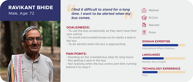
With a high-level solution in place, it was time to define the user personas and their journey while using the solution. In order to widen my scope, I created 3 different personas with completely unique use cases and mental models.


TASK FLOWS
These elaborate user journeys were then converted into possible task flows of the application which further acted as a skeletal structure while prototyping.
IDEATION
Along with the user journey and task flow development, I had also started brainstorming and ideating about the concrete must-have features as well as additional unique offerings that can be given to improve the experience.
In order to properly organize them, I conducted a card sorting activity to group them in the most sensible manner.

Once that was done, I proceeded with sorting them using an Importance Frequency Graph.
Lastly, I mapped everything in a structural information architecture diagram.


PROTOTYPING
After finalising the IA, it was easier for me to make a consolidated list of screens and interactive flows that I would need to design. Once that was done, I started with rapid low fidelity prototyping using paper sketches. These sketches were great to make options and easy iterations.
The best outcomes were then converted to digital wireframes.


WIREFRAMES


Outcome
USER INTERFACE
After multiple iterations in the prototyping stage, I had a relatively concrete structure of the application which helped me pictures the look and feel of it. In order to be well informed about what is already out there, I also looked at multiple existing travel guide applications.
For my color scheme, I wanted to sober down the extremely bright colors of the existing PMPML application.
For the UI components, I converted the sharp-edged buttons and fields to more rounded shapes to look more approachable. I chose an easy-to-read font that is relatively wider for better readability in outdoor environments.
STYLE GUIDE & UI COMPONENTS


HIGH FIDELITY USER TESTING
With the high-fidelity prototype ready, it was time to validate my design decisions. I went ahead with summative testing with a limited number of real users. To actually decide the users, I also created a test screener document.
To gain elaborate feedback, I also created a task script document which consisted of the various tasks they were given, a few pre-test and post-test questions.
Like any other usability test, there was both positive and negative feedback. The positive findings helped me validate many of my design decisions whereas the negative findings helped me iterate and improve my designs. I also had few suggestions from the users which I decided to take in order to improve my solution.
DESIGN ITERATIONS
Naming of buttons on dashboard was confusing
Should have more visuals and icons
Edited the names and icons of the CTA Buttons
Added icons for each option
01.
02.
SEVERITY : HIGH
SEVERITY : LOW


-
Headings like navigator and information were very vague and were misleading users
-
Instead they were preferring to use the search option
-
Icons were recalled more than the headings hence they were necessary in the menu as well.
Very plain design/ unappealing
03.
04.
Cannot find 'saved places' in Menu
Added some visuals to make the app more welcoming
Edited the Menu and added saved places for easier access
SEVERITY : MEDIUM
SEVERITY : LOW


-
The design was perceived as too simple or plain as ease of use was the main focus
-
It looked boring and wasn't appealing enough
-
The hamburger menu is not intuitive enough
-
Users cannot find important things like saved places and trusted contacts under account settings
-
Too many clicks to access information
Cannot find Account Easily
05.
06.
AR Guide steps are confusing
Edited menu and added My Account
SEVERITY : MEDIUM
SEVERITY : LOW
Changed the steps from 3 screens to just one screen


-
The account section was hidden under account settings.
-
There was very less affordance and users were taking time to find it
-
The steps on how to use the AR Guide were leading to errors
-
Progressive disclosure was confusing
Innovators Comments
07.
Added alert option for stop while traveling in the bus
Added google maps navigation option in the directions page


Final Solution
Find your way in no time
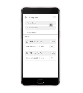
Once logged in, the user will land on a dashboard which has multiple options to help him get around.
Upon selecting Find Your Way, he can simply enter his start and end location, to see the buses that he can take and the duration it will take.
He also has an option to enable alert which will notify him when the bus is about to reach his starting and ending stop.
Easily find bus stops near you
This app will also help out users who may be in a new or unknown area and want to find out which the nearest bus stop is.
They can easily see the closest options here with an additional feature which shows the image of the bus stop. These images will be added by the users themselves.
Safely share your route with your trusted contacts
The users also have a My Account page where they can save their frequent addresses and trusted contacts.
The route and live location can be instantly shared with the saved contacts for a safer journey.
THE AR GUIDE
The most unique offering of this application is the inbuilt AR feature which is based on the Recognition based AR and SLAM technology, The user can either select the AR Guide feature from the dashboard or he can select it while viewing the oncoming bus on the map.
He will just have to point his mobile camera at the approaching bus and the app will analyse and show the user if that is his desired bus.
He will also be able to see the next bus timing and the available capacity to prevent overcrowding


**This is a hypothetical proposed feature which can be implemented in the near future with the help of advancing technology.
