Project Name
Role
Duration
Domain
Energy Forecasting Cloud
Sole Product Designer
1 Year
Product Design, SaaS, MVP Design, Testing and Iterations, Energy Forecasting, Web App Design, User Interface
To comply with my non-disclosure agreement, I have omitted confidential information in this case study. The information in this case study is my own and does not necessarily reflect the views of SAS. All designs are part of SAS's intellectual property.
Overview of the problem
How might we re-envision the experience of the SAS Energy Forecasting’s legacy solution in a cloud based SaaS solution using Microsoft Fluent?
The SAS Energy Forecasting solution predicts future electricity demand, helping energy companies manage supply and plan efficiently to prevent outages, manage costs, and integrate renewable energy sources like wind and solar.
Outcome
A brand new product developed from the ground up and effectively introduced
across more than
65 e-commerce channels
across
5+ SEA countries
Understanding the forecasting process

Research plan
-
What are current industry best practices, emerging trends, and potential opportunities?
-
What are SAS’s business objectives, target market segments, and strategies?
-
What are the current workflow processes and associated gaps?
Competitor study
Identified 3 similar forecasting solutions and did a competitive analysis to identify strengths, weaknesses and opportunities
Semi-structured interviews
Online. Total sample size - 6 participants
Legacy solution customers - 5 participants
Stakeholder (Business & product team) interviews - 1 person
UX review
Evaluation of the legacy product, to assess how well it meets the needs of its users and identify friction points and areas of improvement.
Usability testing
Evaluated the product’s usability by having participants complete tasks on their own and collecting feedback through ratings, surveys, and conversations.
Competitor Analysis
I did a competitive study of Hitachi Nostradamus, Scipher and Itron to understand the competitor landscape and user expectations in order to prioritise design efforts and identify the competitors weaknesses if any.


Key takeaways
Effective visualization through line graphs for trend analysis
Logical dashboard organisation for intuitive navigation
Consistent colour schemes improve clarity
Overwhelming information presentation hindering quick insights
Lack of interactive features limiting data exploration
Complex navigation structure increasing user learning curve
It's important to prioritize information and present it in a way that is easy to digest.
Interactive features that allow them to explore data in more depth, such as sliders for adjusting time frames, drop-downs and interactive charts
Simplifying the navigation structure and providing clear, concise labels can help users find what they need more efficiently and reduce the learning curve.
Users
I conducted semi structured interviews with five diverse customers to explore their workflows, needs, preferences, and identify any gaps related to the product.


Pain Points
Outdated Interface
The design feels old-fashioned, making it less intuitive and harder to navigate.
High Cognitive Load
Users struggle with overwhelming data presentations and lack of clear prioritisation.
Steep Learning Curve
The solution struggles to handle growing data or evolving business needs effectively.
Complex Workflows
Processes require too many steps, increasing the time and effort needed to complete tasks.
Lack of Real-Time Updates
Data isn't updated frequently, resulting in outdated or inaccurate forecasts.
Scalability Issues
The solution struggles to handle growing data or evolving business needs effectively.
Objectives
1. Data-Driven Decision-Making
Create features that allow users to effortlessly monitor key metrics, compare competitor products, and analyze market trends.
2. Simplify Competitive Analysis
Design features that allow users to monitor key metrics, compare products with competitors, analyze price trends, and manage pricing rules, thereby enabling efficient decision-making.
3. Seamless Integration and Usability
Design the product to easily integrate with multiple marketplaces, ensuring a user-friendly experience with minimal operational complexity.
4. Actionable Consumer Intelligence
Understand overall brand perception, track product and store ratings and use the competitor benchmarking to improve performance
Initial Brainstorming
Post that, we did a brainstorming session to get an idea of what features the solution should have.

I organized a Design Brainstorming Workshop with over 20 participants. This collaborative brainstorming session played a crucial role in reshaping our MVP.

Compiling Insights
We used post-it notes for the various ideas that came up in the workshop.

Card Sorting
We used the inputs from the brainstorming session to do a card sorting activity where we grouped the items in their logical order.

Prioritizing generated idea clusters
Task Flows


Information Architecture
The last step was to create a detailed information architecture of the solution with all the elements on each page as well as the actions noted down.

Wireframes
I created a set of high-fidelity wireframes, deliberately using minimal colours to prioritize functionality before incorporating the visual design elements.


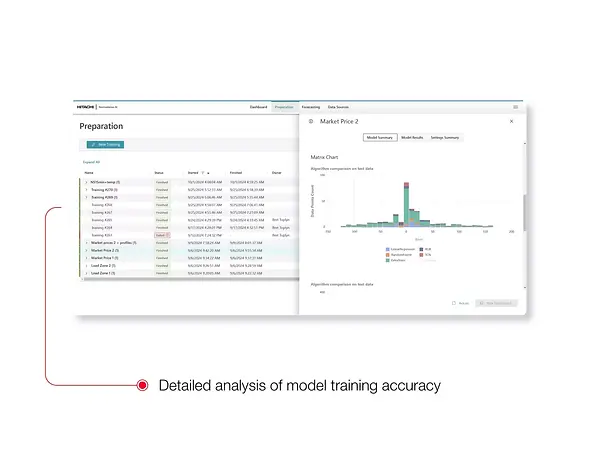
The Solution

DASHBOARD
1
Added a primary left navigation for switching between main modules along with a global selection of your brand and search on the app bar.
2
Quick filters available on top to filter relevant and important data.
3
Most important KPIs indicated in the first row along with a visual graph and Week on Week, Month on Month change percentage.
4
Other important information depicted in easy to grasp visual charts. Freedom to adjust placement using draggable cards.


ONLNE MERCHANDISING
1
User can analyse the performance of their brand as well as their online store using benchmarking paramteres against the competitors.
2
Important KPIs such as product sales based on demand, inventory stock as well as sentiment KPIs based on ratings and reviews highlighted.
3
Under the store tab, user can see all his online brand stores and their performance. Sales and health metrics, along with a table comparison with other brands on various e-commerce platforms is available.
4
A visual overview of all categories of the brand based on KPIs can be seen. User can also drill down to the individual SKU level performance.


DISCOVER AND COMPARE
1
Under the discover module, user can select any of his own product and compare it with its competitors.
Application will suggest products based on history or significant performance change.
2
The competitor products can be viewed in a grid or list format along with easy filtering options.
3
User can use quick compare or deep comparison to see the details. Deep comparison gives a complete picture on promotion, product quality, buyer engagement and store health comparisons.


PRODUCT SCORECARD
1
Each product will have a scorecard which will contain all the important information along with actionabe insights.
2
The scorecard is divided into 3 tabs - overview, product quality and promotion analysis. Each contains visual charts and highlighted numbers based on performance.
2
The scorecard can be viewed based on each e-commerce store the product is listed on.